CloudHealth was a sophisticated platform that asked too much of new users on day one. We rebuilt the experience around a single rule: deliver value in the first session, no setup, no training, no support call. Six concrete moves carried it — zero-click insights, role-curated content, off-canvas detail, pre-computed actions, goal-led navigation, and recommendation-next-to-action — and the redesign became the playbook for the rest of the platform.
The challenge
CloudHealth (acquired by VMware, now part of Broadcom) is a leading public cloud management platform — and a sophisticated one. By the time I came in, it had grown into a power tool for cloud administrators. The downside of that evolution: new users couldn't get value out of it without extensive onboarding. They'd sign in, struggle, schedule a training session, and only after a support call did the platform start paying back the ticket price.
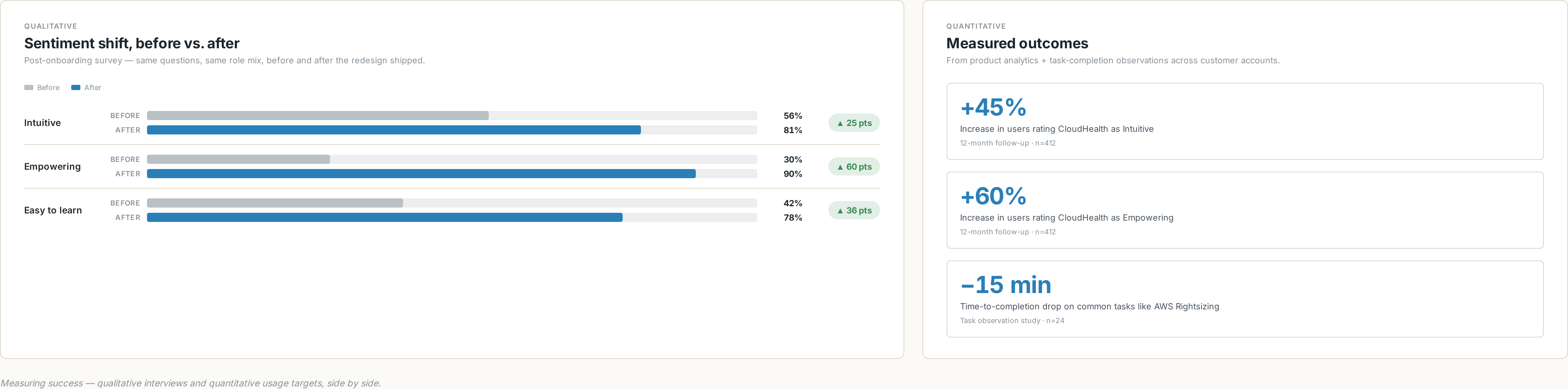
Our post-onboarding survey told the story plainly. Only 30% of new users called the platform "Empowering." Only 56% called it "Intuitive." The product was powerful and people knew it. They just couldn't get to the power.
Project goals
- Simplify the experience and dramatically speed up time-to-value for new users.
- Bubble up valuable content — surface impactful savings and optimization strategies on day one, with zero effort by the user.
- Curate to the user's role and admin level to remove data noise and let them be productive on the first session.
- Eliminate unnecessary steps in major workflows — calculate data points in advance, offer direct actions, skip the navigation chains.
- Visualize problems like anomalies and inefficiencies, and give users a one-click path to remediate them.
Research approach
We used a mixed-methods program — competitive analysis, customer interviews, brainstorming workshops, prototype testing, personas, end-to-end customer journey maps, and information architecture work. The questions we kept coming back to:
What we asked // framing
- Which design and system changes will have the greatest impact on time-to-value?
- What obstacles block new-user adoption today?
- Which data could we surface earlier in the experience?
- Which tasks could we automate or eliminate to deliver value sooner?
- How do customers actually interact with the app on a daily basis?
How we found out // methods
- Customer interviews across roles and seniority levels.
- Brainstorming workshops with stakeholders, ranked on an impact-effort matrix.
- Competitive analysis of the multicloud management category.
- Personas built from interview data and re-validated with the field.
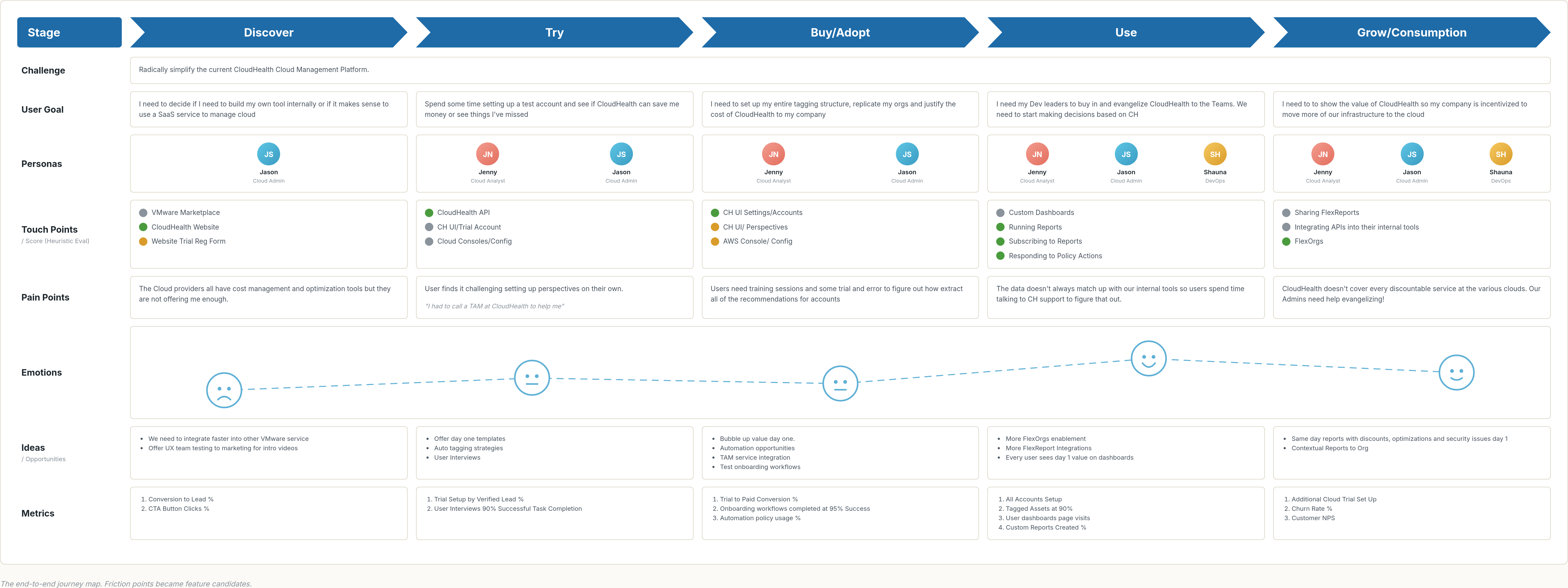
- End-to-end customer journey maps to visualize friction.
- Sketch → wireframe → high-fi prototype → user-test loops in Figma and InVision.
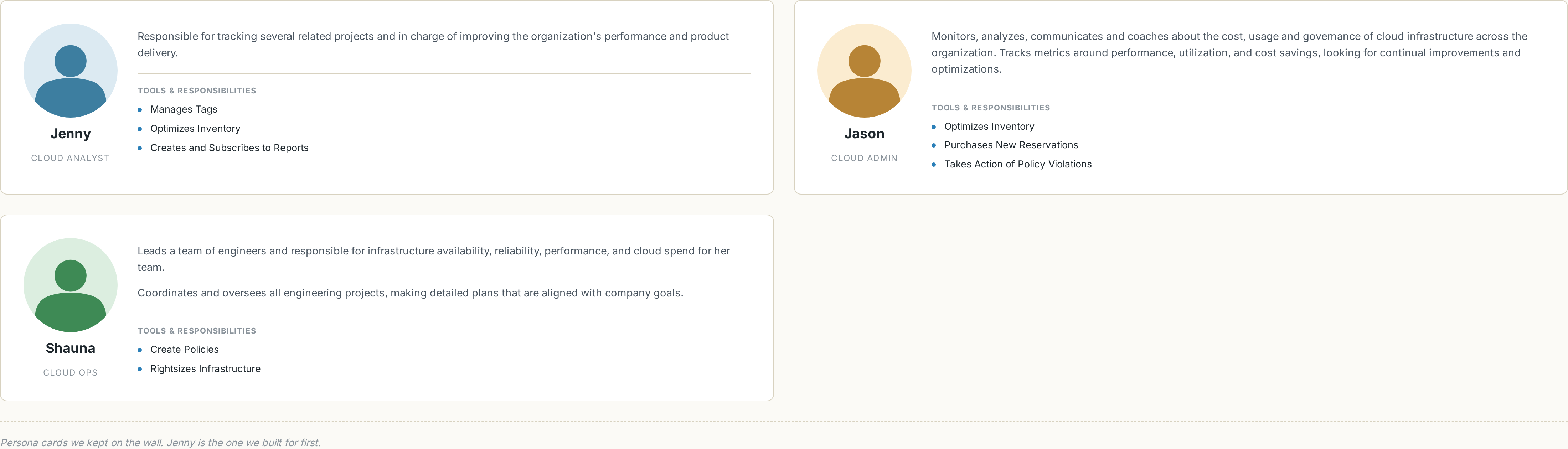
Personas
Three personas shaped the design. The primary kept us honest: if Jenny the Cloud Analyst couldn't get to value in her first session, the redesign hadn't shipped.
Jenny — Cloud Analyst, Day One
Jenny signs in to the platform on her first day at work. She tries to build a report on AWS Reserved Instance savings. After ten minutes of clicking around, she calls support — and finds out she needs to sign up for training before the platform will start helping her.
Workshops & the customer journey
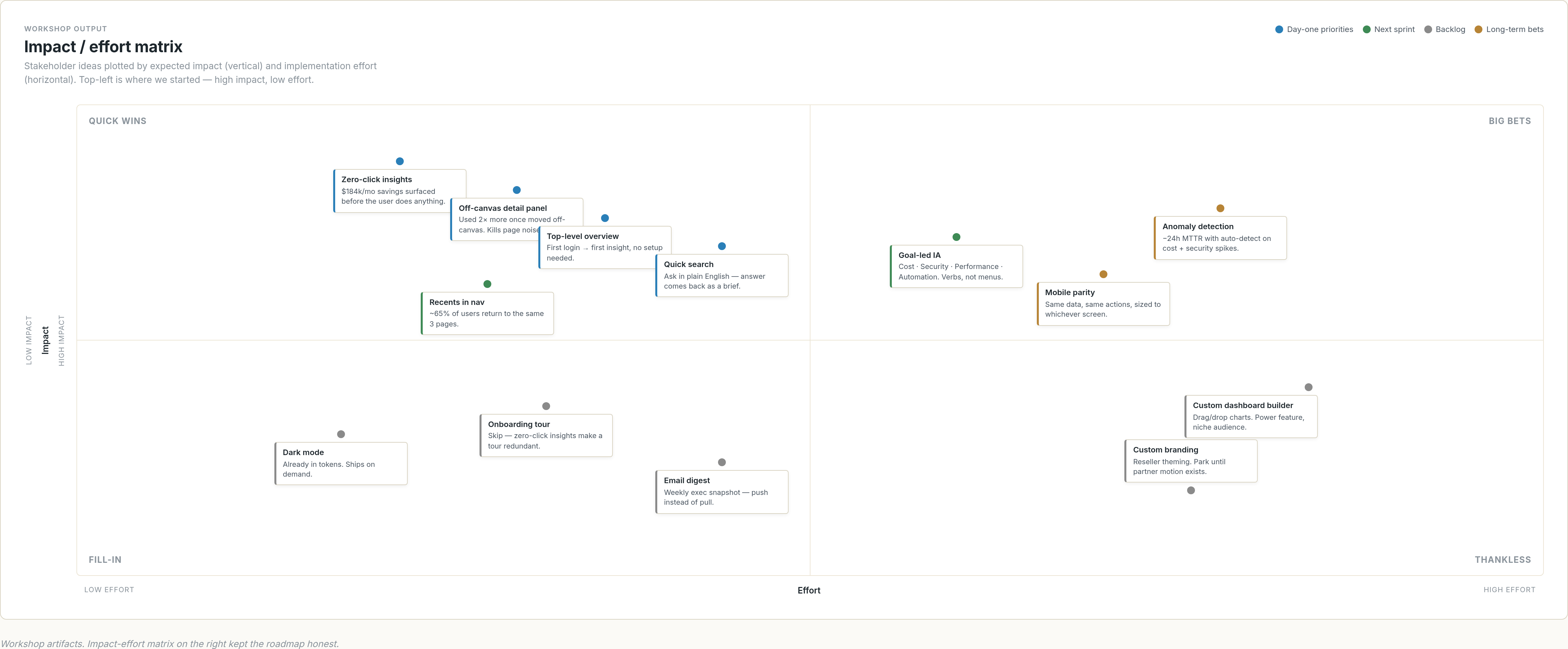
I ran stakeholder workshops to surface needs and roadblocks early. We used an impact-effort matrix to rank feature proposals so the team could sequence them honestly — the easy-and-impactful ones first, the moonshots tagged for later.
From the interviews and workshops, I built an end-to-end customer journey map. Each friction point in the map became a candidate feature for the redesign — and a place where, in hindsight, an agent could now do what we did with rules.
Research insights drove the redesign
We synthesized the research with affinity mapping, sketched a new direction, built a high-fidelity prototype, and re-tested with users to validate. The redesign came back to the same handful of moves, over and over.
 1
2
3
4
5
6
7
8
1
2
3
4
5
6
7
8
- The download action did not show to be as popular as we thought.
- Instead of total spend, show the most impactful top cost drivers.
- Opportunities by month were not as important as we thought.
- Branded colors in the chart were deceiving.
- The detail was used twice as often when we changed it to an off-canvas panel.
- Security-focused users did not like seeing cost and security mixed in one view.
- Hero report was seen as a powerful motivator, but admins thought it would be difficult to define success.
- We found the efficiency score was very important, so we made it more prominent.
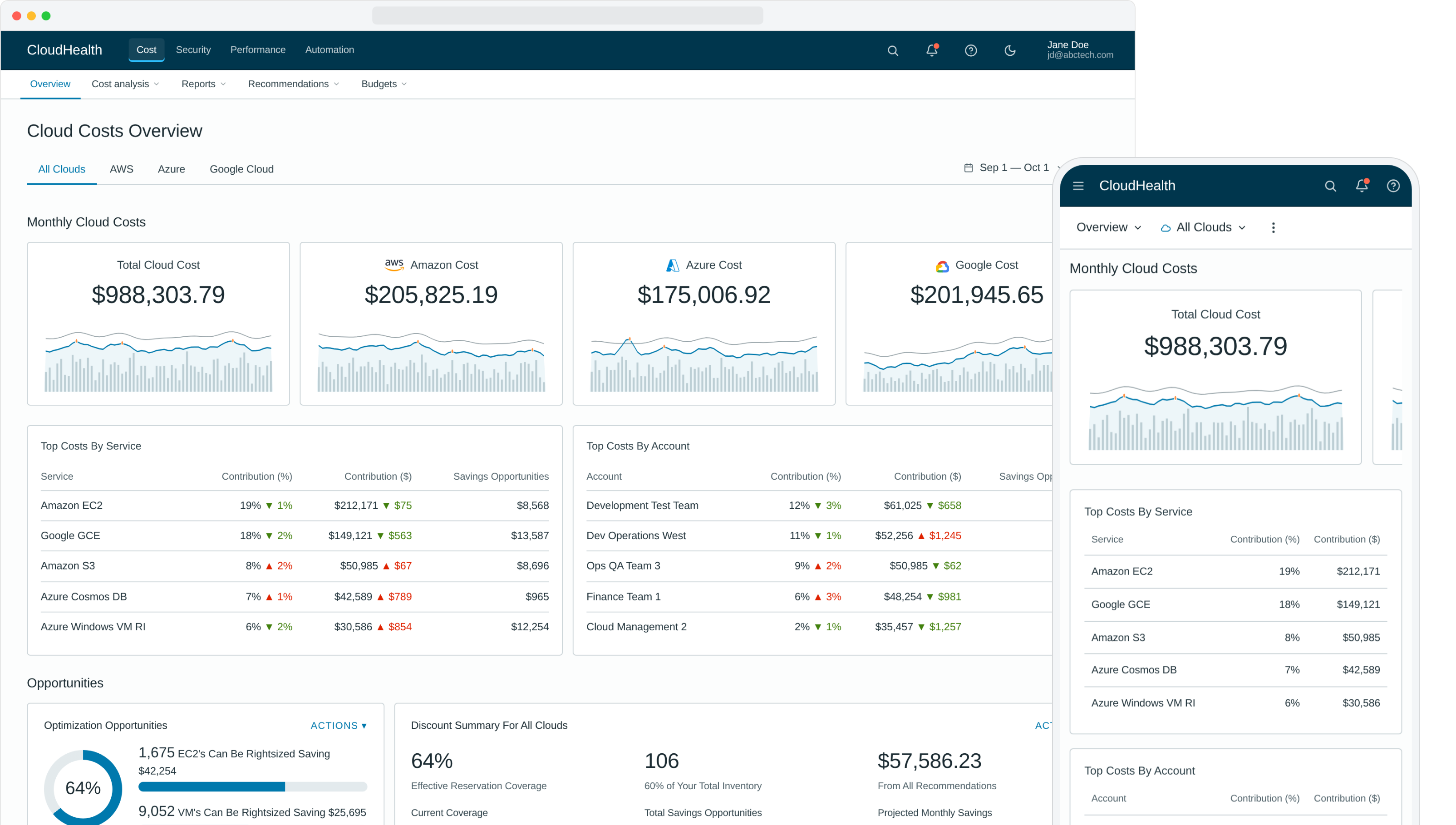
What we removed or quieted. The Download CTA, which testing showed was barely used, dropped from a primary button to a quiet icon link. Opportunities-by-Month was retired entirely — a trailing 12-month chart never beat current-state at a glance. Branded sparkline colors gave way to a single neutral CloudHealth blue once we saw users reading orange and green as positive/negative signals instead of as provider identity. Security was lifted out of the cost view because security-focused users told us the mix was friction, not context.
What we promoted. Total spend was reframed around the top cost drivers — the aggregate number wasn't what anyone made decisions from. The detail panel that crowded the canvas moved to an off-canvas drawer and was used twice as often. The hero report tested as a strong motivator, but admins worried about defining success, so it shipped as an opt-in module rather than the page's lead. The efficiency score that had been buried in the rail became the page's lead metric.
What shipped — six moves that made the redesign
The new design moved from low-fi wireframe to hi-fi prototype the moment the research had landed. Layout, IA, and the day-one content slots came first; visual treatment and motion came after.
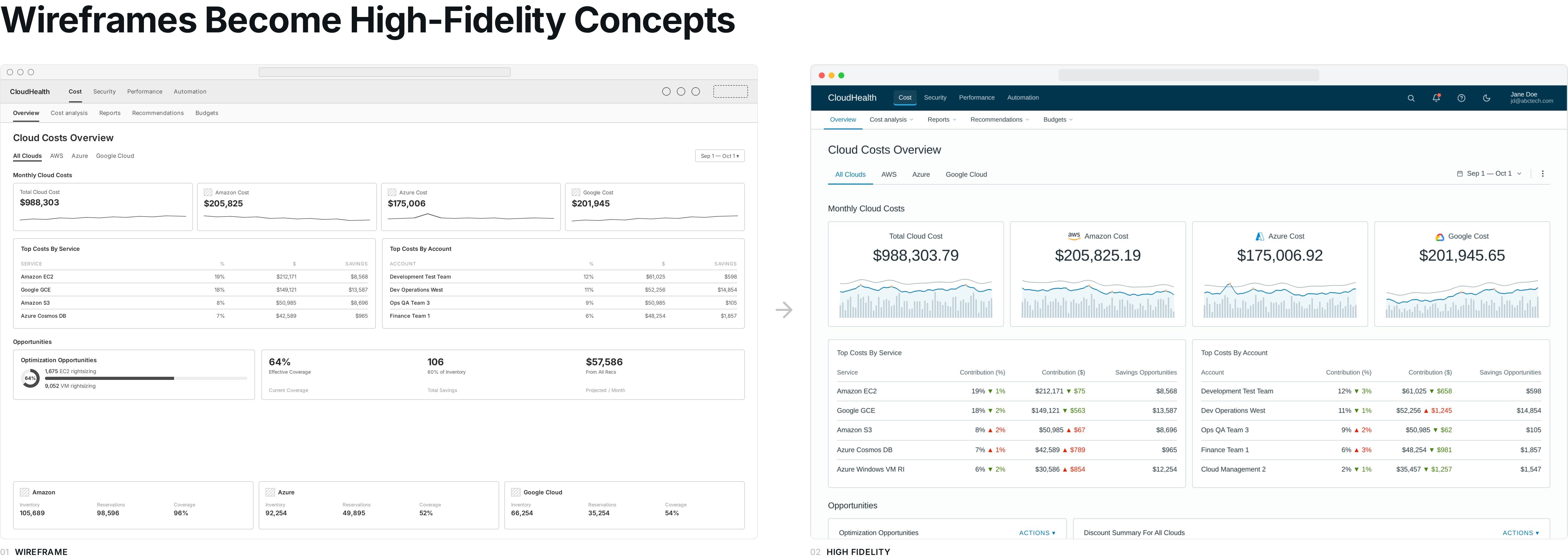
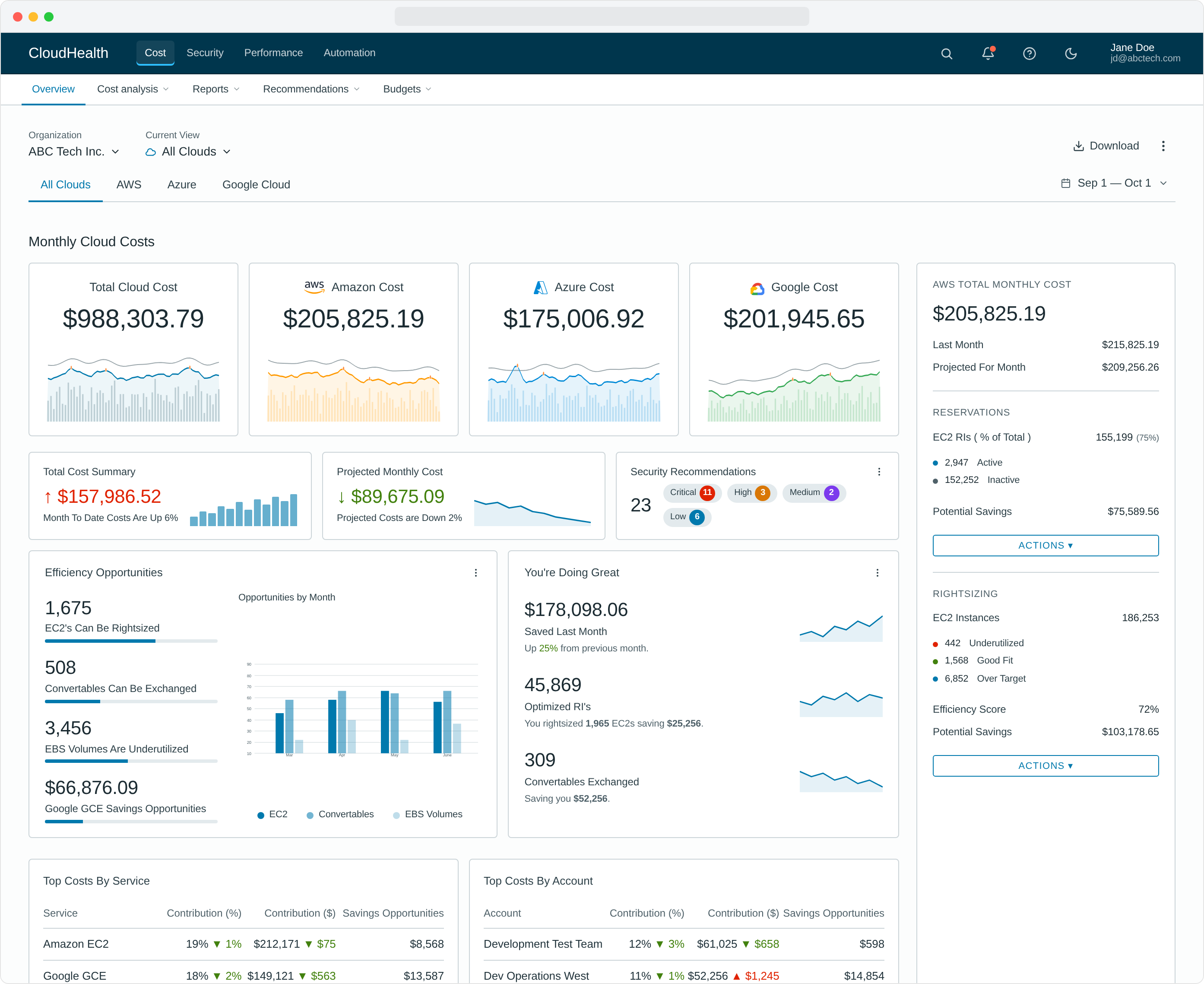
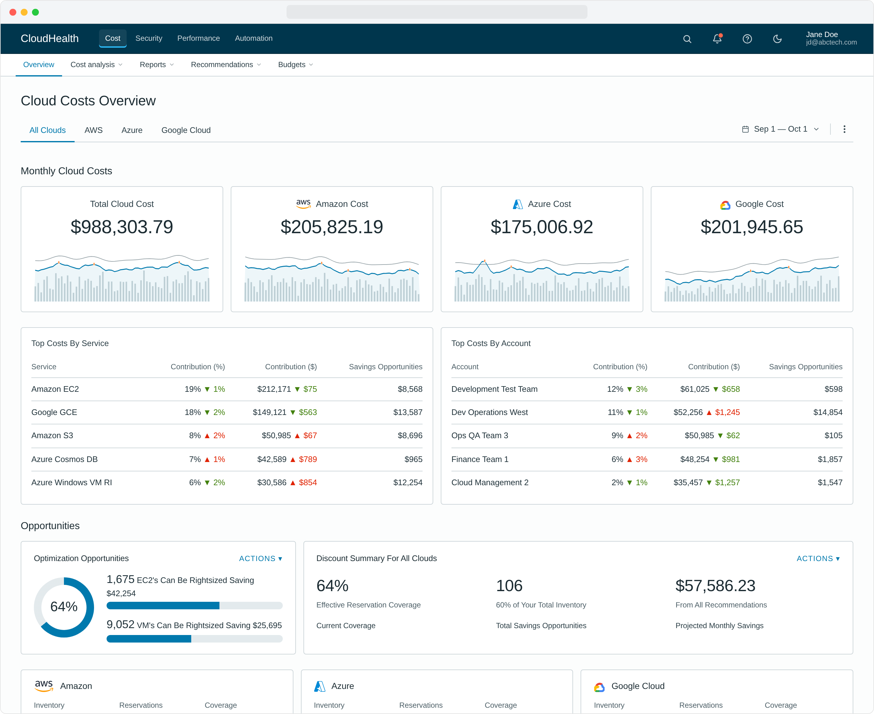
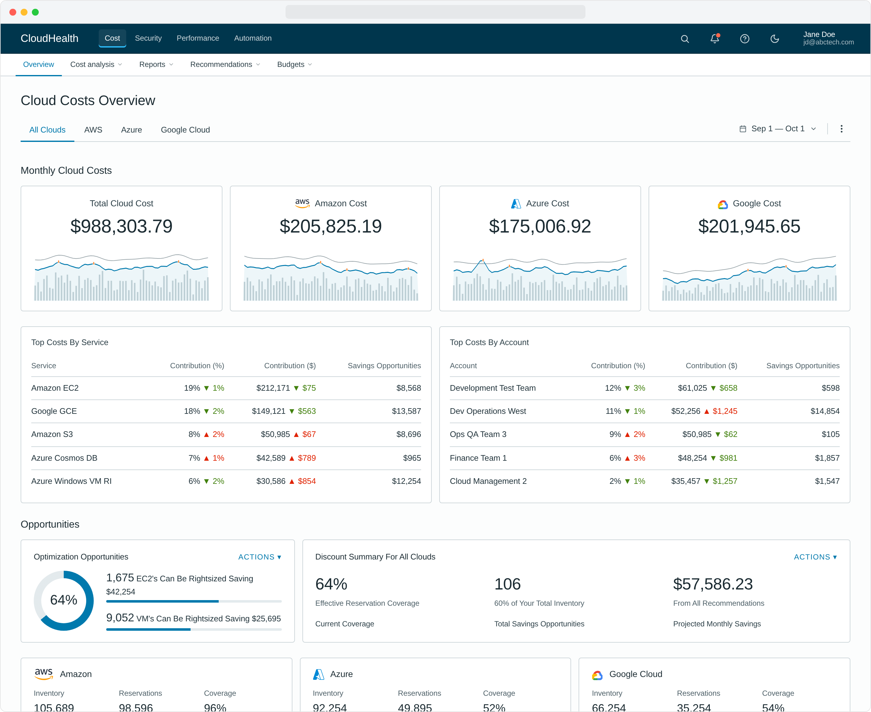
1. A new top-level overview experience
Overview landing pages became the user's first stop on every login. Previously hidden, hard-to-calculate data — savings opportunities, efficiency scores, anomaly counts — sat right at the top, no setup required.
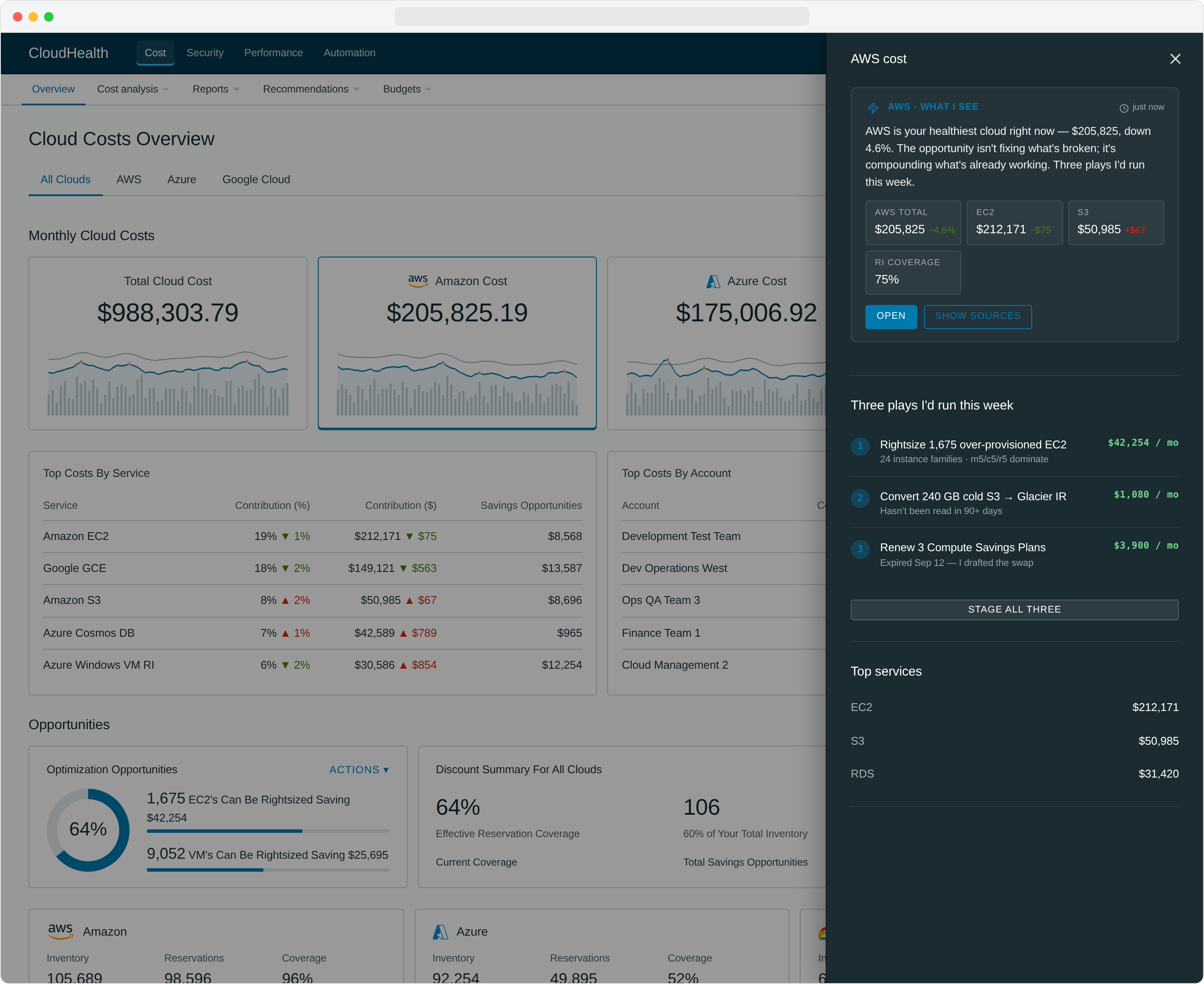
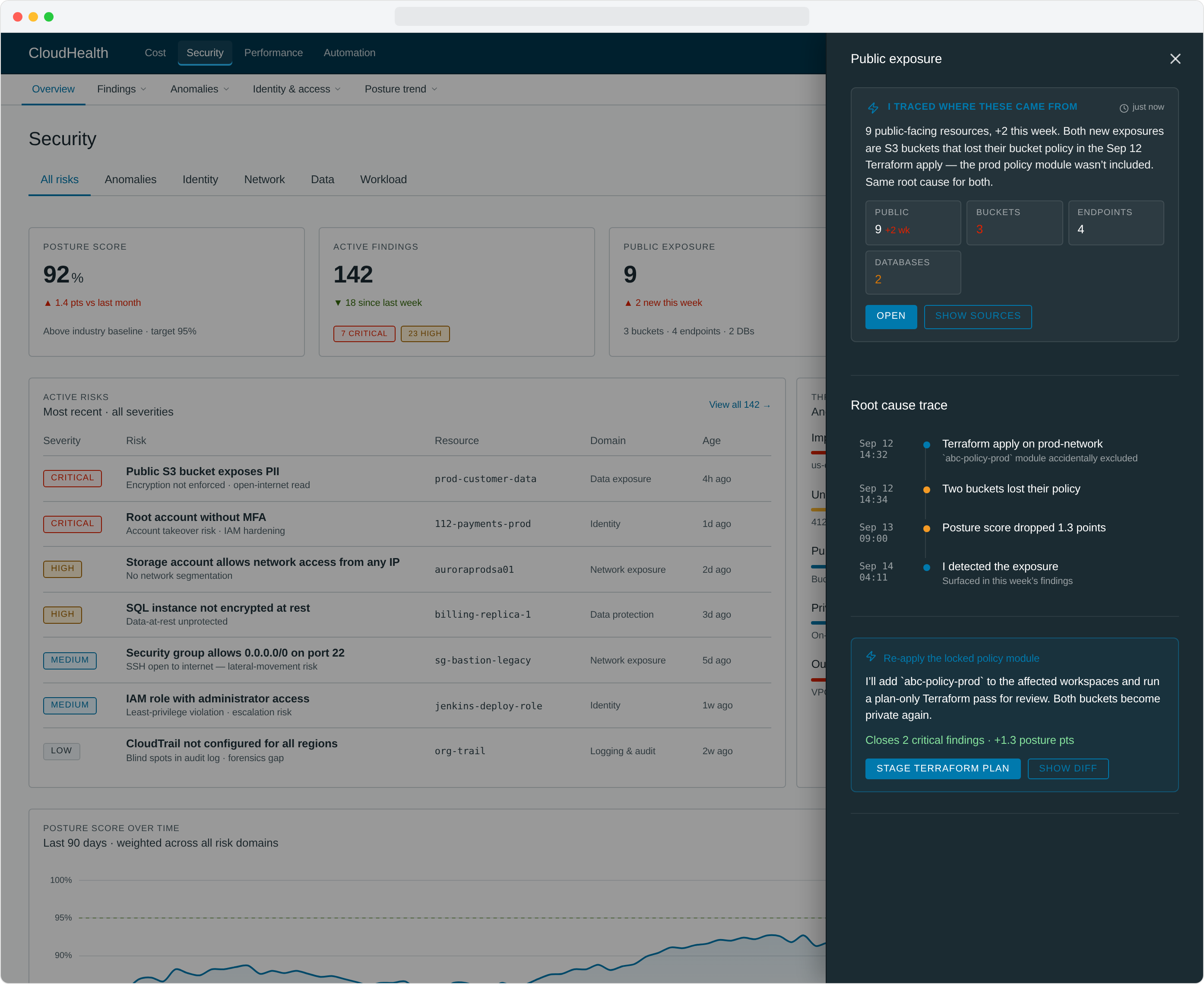
2. Off-canvas drilldown that does the work for you
Users wanted to drill into the opportunities surfaced on the overview without navigating away. Our first attempt put detail persistently on the page and promptly created visual noise nobody could parse. We moved detail to an off-canvas drawer that opened on demand — but kept going past "drilldown." Each panel reads like an analyst's brief: a plain summary, the metrics that matter, and the next thing to do. The right rail isn't showing you data, it's handing you a draft.
Every metric panel is shaped to its question. AWS cost surfaces a numbered action plan ("three plays I'd run this week"). Azure cost flips into an auto-fix card with an Approve / Skip pair. Public exposure traces a chronological root cause from a Sep 12 Terraform apply to the buckets that lost their policy 90 seconds later. Latency spikes get a minute-by-minute timeline with the deploy that caused them. Approval-heavy metrics like Automation Actions show a queue of pending changes with bulk approve. None of these are tabs the user has to find — they're already in the right shape when the rail opens.
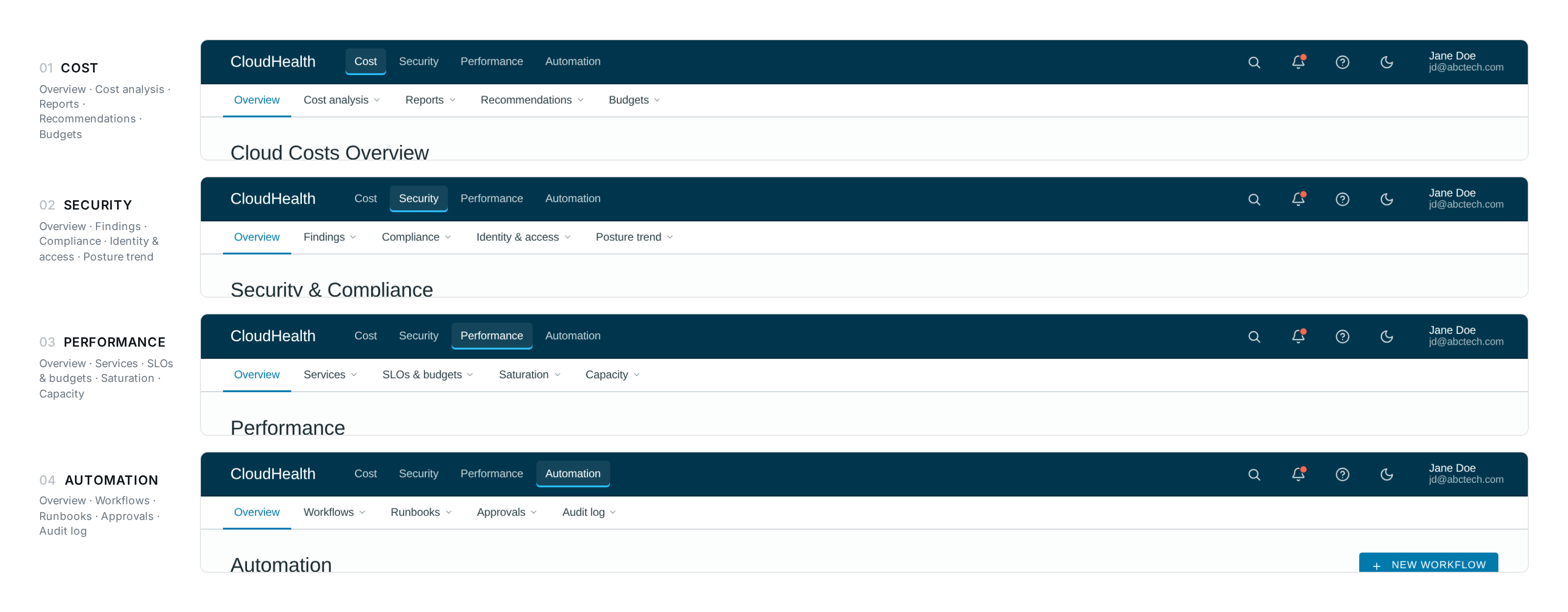
3. Improved navigation
We rebuilt navigation around the user's job, not the product's catalog. The IA stopped asking "where do you want to go" and started asking "what are you trying to do."
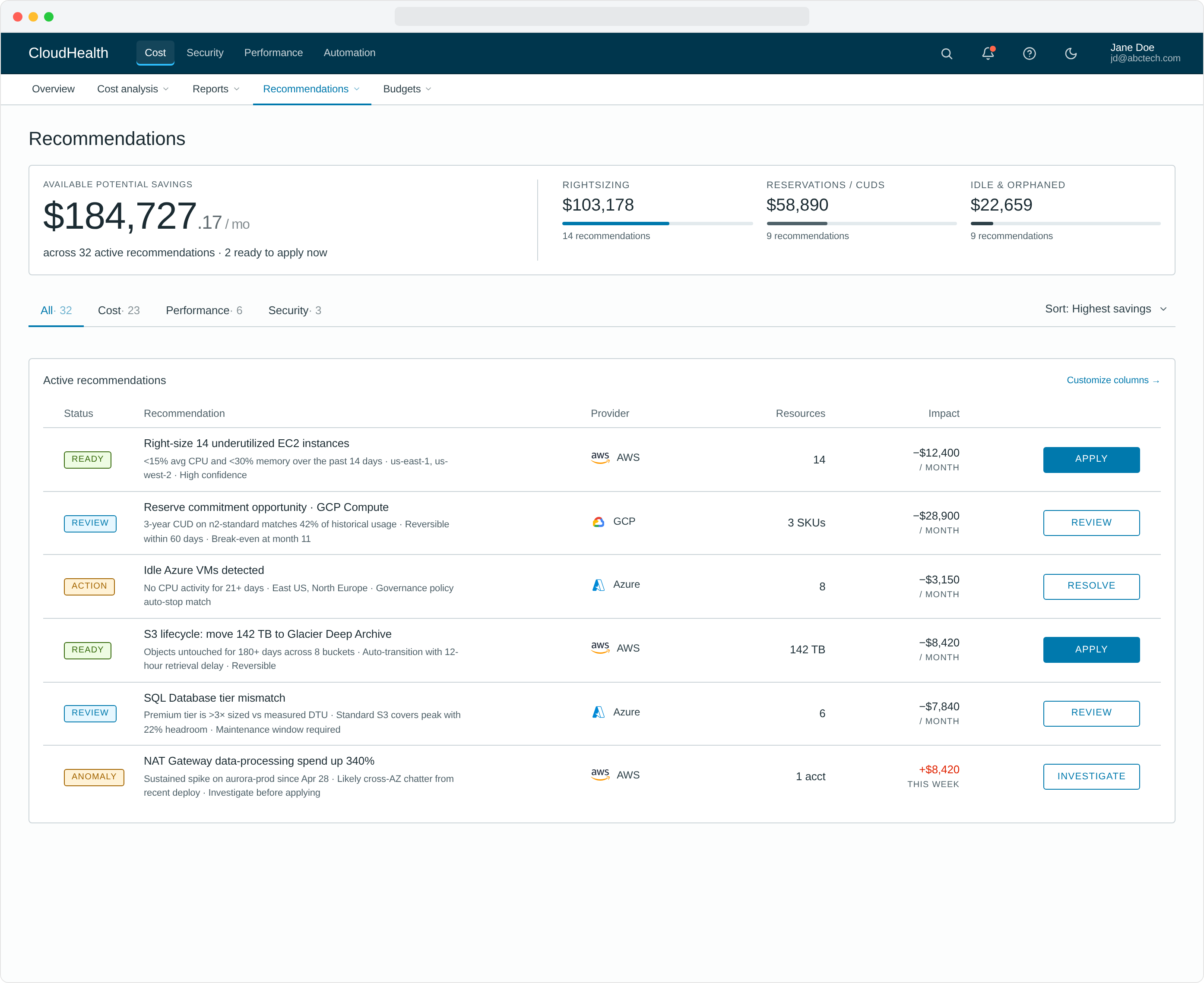
4. Zero-click cloud insights & actions
High-impact optimization opportunities appeared by default for every user — efficiency scores, top recommendations, one-click actions to remediate. No filters to set, no reports to build, no training to take. The smartest thing on the page was already on the page.
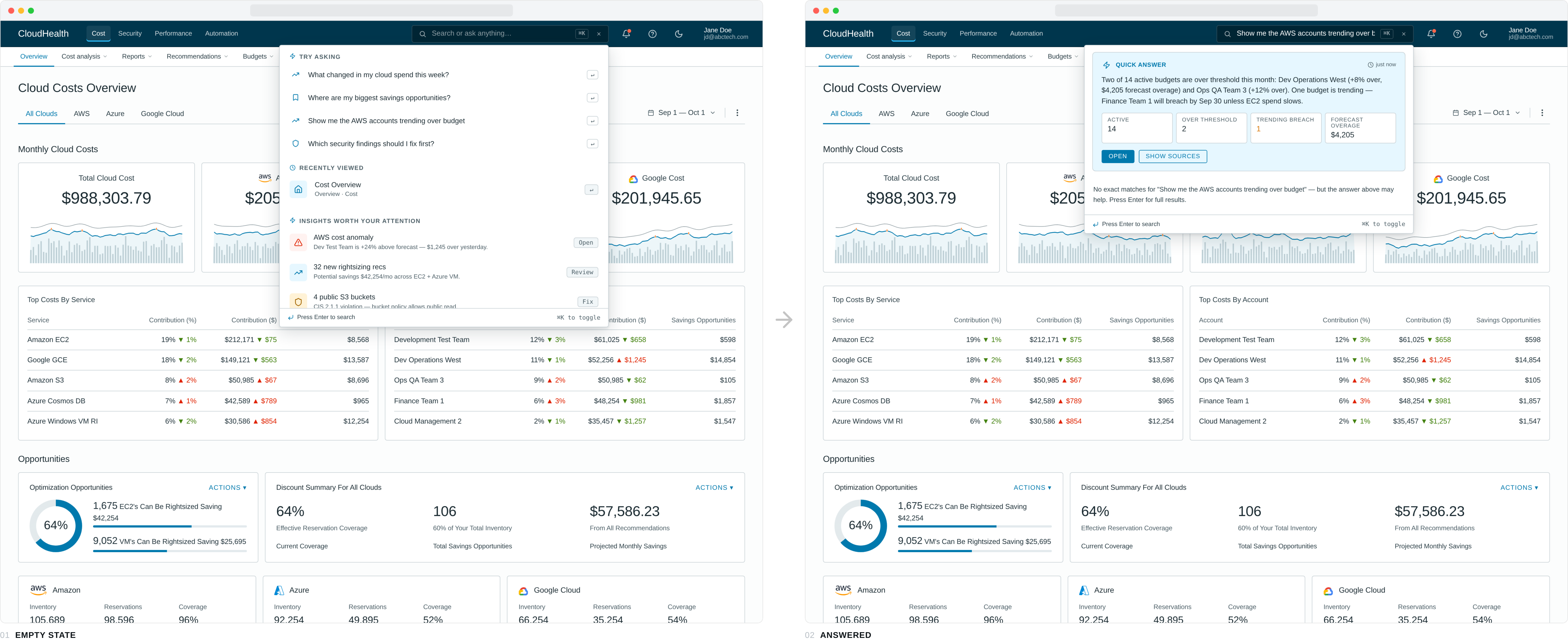
5. A search bar that answers, not just finds
Search lived in the top nav, but pressing it stopped looking like search. The icon expanded into a dark inline field that took the user's question — phrased in plain English — and the dropdown that opened underneath returned an answer first, links second. Empty state offered four typed-out questions worth asking ("Where are my biggest savings opportunities?", "Which security findings should I fix first?"). A typed query routed across nine topic models — cost, savings, accounts, budget, anomalies, security, AWS, Azure, GCP — and produced a one-paragraph summary plus four metric tiles tuned to the question. Below the answer, matched pages and related insights kept the navigation use case alive.
For "show me the AWS accounts trending over budget" the panel returns the two budgets that breached, the dollar overage, the account that will breach next, and a forecast date — before the user has hit enter. The same query a year earlier would have asked the user to pick a report, then a filter, then a column.
6. Accessibility & mobile responsiveness, designed in
Accessibility and responsive layout weren't a "phase two" — they were in the original spec, the original tokens, the original component library. The Elevate Design System we'd already shipped at CloudHealth made this affordable to do correctly.

The principles underneath
Six concrete moves are easy to inventory. The principles underneath them are the harder thing to name — and the ones the rest of the team kept reaching for as the redesign spread to other workflows.
Earn day one
The smartest thing on the page is already on the page. No setup wizard, no empty state, no "configure to get started."
Curate to the role
An analyst is not an admin is not a finance partner. The default view matches the role; everything else hides until asked for.
Pre-compute the answer
If a question gets asked every Monday, answer it before the user shows up. Move the work from the user's morning to the platform's overnight.
Diagnosis next to action
Every problem the platform surfaces travels with the way to fix it. No dead-end alerts, no "go find someone who can do this."
These four sit underneath every screen in the redesign. They are also the part of the work I find myself going back to whenever I'm stuck on a new product — different domain, different stack, same questions.
Measuring success
Both qualitative and quantitative metrics. The interviews told us if the new experience felt right; the numbers told us if it actually worked.
Beyond the numbers, the redesign got picked up as the new standard for priority workflows across CloudHealth — Northstar Dashboards, Cost Reports, AWS Savings Plans, Instance Rightsizing, Discount Manager, Anomaly Detection, API Test Access, Perspective Management, Partner Billing, and CloudHealth One. One redesign that became the playbook for the rest of the platform.
Lessons learned
Persistence and patience
This project was funded for development and then pushed down the priority list on the roadmap twice. It wasn't until we presented the research and the value of the improved experience to wider audiences that the project finally got its real funding. Sometimes the right move is to keep telling the story until the right ears hear it.
Use meaningful data points early on
Projects often don't have an obvious ROI or a way to articulate success. Find data that expresses the value of the improvements in a language stakeholders already speak. The "Empowering" / "Intuitive" rating delta sold this redesign more than any heatmap or flow diagram could.
And one quieter lesson, the one I take with me to every product after this: get the principles right and the surface stops being the hard part. Earn day one, curate to the role, pre-compute the answer, put the diagnosis next to the action — once those rules are in the bones of the system, individual screens get easier and the whole product gets clearer.